Penmanship
In 2004, as part of my public school’s 6th-grade curriculum, I took a penmanship class. I don’t think kids take penmanship class these days.
In penmanship class, we wrote cursive. Cursive dictates that, aside from a few occasions, the pen maintains contact with the paper. All letters in the cursive alphabet flow into each other using romantic ligatures.
In penmanship class, we learned a standard cursive font. I think it’s the standard cursive font, in fact. Mr. Hamilton handed out printed sheets with an alphabet of cursive letterforms. We slowly traced these letterforms on thin notebook paper until our muscles could remember them unconsciously. This unlocked for us the adult world of cursive handwriting (and reading). Perfect for signing our names on legal documents, keeping secret diaries, and crafting Valentine’s Day cards.
Mr. Hamilton made sure that each student could read and write cursive before entering 7th grade.
Why bother?
I never write cursive these days. Nobody writes it anymore. Nobody can read it, anyway. And I honestly couldn’t write it neatly anymore even if I tried. Cursive is obsolete. An artifact of a bygone era where people had to read your handwriting before they hired you, married you, or accepted your precocious children into exclusive East Coast boarding schools.
I rarely hand-write in the first place. Mostly, I type. Mostly, we all type. We all use the same digital sans-serif fonts (or maybe not ↗), transmitted via ocean wires and satellites between digital screens, composing tiny notes for the entire internet, consuming the latest news from “newspaper” websites, rattling off college research assignments, and writing web blog posts nobody will read. We don’t really need to hand-write, ever. Unless we’re filling out tax forms. Unless we do our taxes online.
And there’s nothing really wrong with typing. Except that it’s only as portable as your computer. Well, I guess most of us carry smartphones everywhere. But smartphones are distraction machines, much better at putting things in our brains than extracting original thoughts out of them.
Handwriting occupies a unique space among the utilities of hands. I use my hands to drive, fix things, type code, clean my house, brush my teeth, cook food, etc. None of these activities is particularly self-expressive; I don’t express myself often outside of speaking. But handwriting is inherently expressive, if not artistic.
Artists use their hands to transmit their thoughts and feelings to other people, and artistic inspiration doesn’t wait until a computer is handy. Handwriting beckons us to express our minds on any surface using nothing more than our hands and a tool. As I hone my handwriting I expand my ability to express myself. I improve my ability to communicate the labors of my soul with myself and, if my penmanship is legible, with others.
For the civic good
Legible writing is social. It considers others.
Architects have a special style of writing that they use on all of their handwritten documents. It’s an industry standard developed to accurately communicate building and design specifications to other architects via pen and paper. The lettering is clean, easy to write, and legible.
The book Architectural Graphics ↗ by Frank Ching teaches its readers how to adhere to architectural conventions.
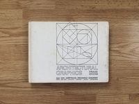
This book contains, among tutorials on how to properly draw sundry types of doors and walls, a chapter devoted to “Graphic Symbols & Lettering”. This chapter teaches the reader how to use the universal visual language of architects, rendering arrows, lines, and letters in strict accordance with the standard.
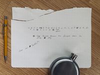
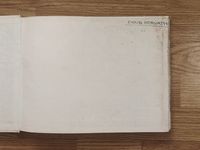
Doug Horvath, who owned this book before me, read this chapter.
Like the cursive alphabet sheets from penmanship class, the chapter contains a printed alphabet of architectural letterforms perfect for diligently practicing the font with tracing paper.
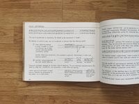
Unlike cursive, there are no ligatures connecting these letters. This style utilizes blunt, separate marks.
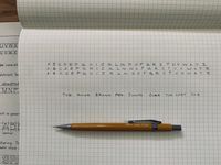
Most non-architectural hand-writers write the letter “P” with a single stroke: draw a small loop and extend the side downward to form the stem. An architectural hand-writer writes the letter “P” using two independent strokes: draw a small circle, lift the pen, and then draw a vertical line tangent to the left-side of that circle, extending downward. The resulting glyph is neat, deliberate, and replicable.
Practicing penmanship takes time. Slow is smooth and smooth is fast. Practicing penmanship unlocks neat handwriting.